
Diffbot Extract Feature
Designing a SaaS Product Experience & Interface

Starting from (near) scratch
A fresh, clean, blank slate: no existing interface
Diffbot is a machine learning startup in Menlo Park, CA that provides developers with tools to transform websites into usable data. Their goal is to make it easier for people to search and understand information on the web. Their services can read sites like a human brain, and then transform the content into structured information to present users with facts that people want to know. Without Diffbot, people run internet crawls to do this, but that requires custom-written codes which can become expensive and tricky to upkeep. When we began this design sprint, Diffbot had no user-facing interface for their Extract feature.
My role:
Research, design, sketching, iteration
Duration:
3.5 week sprint
We started off by defining the problem:
Diffbot’s current Extract tool does not have clear directions for users to be able to navigate on their own to fix errors. Users need to be able to edit fields and customize the API rules but there are major points of disconnection in the interface which make it difficult to find solutions. This causes users to become frustrated with the tool and forced to contact support or quit the service.
A major point of disconnection
Understanding our starting point
For this project, we focused on the Extract feature which didn’t have an interface. Diffbot recognized a growing need for a more user-friendly experience because more non-developers were starting to use the platform. The site uses a lot of highly technical developer language, such as APIs (a set of rules that programs use to speak to computers) and CSS Selectors. Though it’s primarily been built with developers in mind, one of the company’s goals is to provide tools that are accessible to all people, no matter their prior knowledge or background.

Diffbot: Test Drive Extract feature
Prior to this, the Extract feature came in two separate parts, Test Drive and Custom APIs. Test Drive is not an actual developer tool, but an interactive feature to allow users to see if their URLs will extract data properly. It does not allow users to edit the data or change the API type. Custom APIs is an entirely separate tool which gives users a lot more flexibility and freedom.
In the original design, users would create or edit by building off a pre-existing API or starting from scratch. This allows a good amount of user freedom and flexibility, but definitely requires developer knowledge of CSS Selectors.

Diffbot Dashboard: Custom APIs
Because the two tools were entirely disconnected in the navigation, even experienced customers still sometimes require help going through this process. New customers were also having a hard time drawing any connection between the Test Drive Extract and Custom APIs. Customers were reaching out on a regular basis to ask for help.
Diffbot is capable of more user freedom than this, but was not equipping users with the connected interface to be able to unlock that freedom.
Like learning a new language
Familiarizing ourselves with developer concepts and lingo
Because Diffbot is a developer tool, there was a steep learning curve to understand the product we would be creating. The head of growth at the company was kind enough to give us several walkthroughs of the tool with different use cases in mind. It was also massively helpful to familiarize ourselves by using the tool ourselves, performing extractions and knowing exactly where to ask questions. We also got a firsthand look at what non-developers might go through while using it.
It was important as always to be sure we were aware of any technological constraints and any capabilities that were previously missed throughout the experience.
Research methods:
Business analysis
Data analysis: business impact
Survey results
Customer support tickets
Heuristic evaluation on current test-drive feature and proof of concept
Contextual inquiry
User interviews
Walking through extractions ourselves - to know where to ask questions
Business impact
The Diffbot team was able to provide business impact metrics which gave us clear understanding on their motivations and goals with Extract. These numbers prove that the disconnection in the tools affects the business. For the Extract tool in particular, if it takes too long to figure out or just doesn’t work properly, customers are more likely to leave to find alternative tools or code on their own.
Impact metrics:
405 paid customers have used Extract at least 100 times this year
10 support tickets a week on Extract questions
5 tickets a week from new users
Around 20 hours a week spent on resolving support tickets related to Extract product
Survey synthesis
Our most informative research came out of synthesizing some pre-existing data. First, we read through the results of a survey Diffbot had conducted in the past year. We focused on responses to two questions of relevance to us:
“Did you have any problems with the service?”
“What do you perceive as the main benefit of the service?”
From each of these, we put together affinity maps to make sense of all the answers. We found a lot of overlapping thoughts and were able to derive some key insights which would later inform our design decisions.
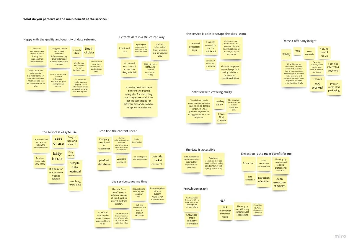
Survey results affinity map
Key insights:
Common issues with missing information but no clear way to resolve
Everybody wants to save time
Most are happy with quality and depth of data
People care about the way data is structured
There’s not enough documentation/instruction
A look at customer support tickets
We were also able to get access to support ticket requests so that we could take a closer look at where customer service spends its time and money helping customers. My teammate and I read through 17 tickets that specifically pertained to the Extract features. We summarized the questions being asked, and found some common issues as well as how the support agents typically solve them. This also gave us critical understanding that we could synthesize into insights.
Key insights:
Frequent issues with specific information extracting incorrectly
Customers are not able to troubleshoot
Several issues with lazy load, data not loading or extracting properly
Some issues figuring out how to use Custom APIs
Issues with some languages translating incorrectly
Getting to know the Efficient Engineers
Developing a focused persona
Each of our research findings gave us information about Diffbot’s target users. At this point we’d developed a sense of understanding and appreciation for our users, and put them together into a persona.
Meet our Efficient Engineer.
About
The Efficient Engineer works for a company that needs to extract data on an ongoing basis to populate information for their website. Their company is known for providing reliable and trustworthy data, which are also their personal values. It’s critical for them to uphold that reputation. They want to save time and would rather not write their own code to do web scrapes, as their main duty is to ensure large amounts of data are extracted consistently and accurately.
Motivations
- Getting the job done quickly
- Data that is accurate and trustworthy
- Staying organized
Goals
- Be able to work independently on extractions and solve problems on their own
- Spend less time on tedious tasks
- Extract accurate, reliable, and structured data
Frustrations
- Disorganized information
- Having no options to resolve errors or incomplete data
- No indication of incomplete data
- Lacking the information they’re looking for
- Having to contact support
Embarking on an enjoyable journey
Mapping the current user journey to identify the ideal path
Our Efficient Engineer had been going through Diffbot’s program without being able to find clear solutions to their issues, and go on a negative emotional path. Our job was to be sure they’d stick to the upward path, getting exactly what they need without having to ask for help.

Journey map
When users are at the high point of using Diffbot for the first time, we want to be sure they don’t drop from that. We want to retain as many users as possible, encouraging them to keep going up by finding the program intuitive and knowing where to go to edit rules and fix errors. After they make sure one page is extracted with complete, accurate data, they can scale the process to as many pages as they need.
A gap in the flow
Understanding the problem by creating user flows
One of the most helpful steps in understanding the current experience was mapping out the current-state user flow. This is a lot to look at. The crucial point of disconnect here is the conditional that comes when edits need to be made: “Do you know where to go?” At this point users either know that they can go to Custom APIs to edit the rules, or they can contact support or quit. If they do know where to go, they’re taken on a happy path to edit their API rules. Usually this knowledge is gained with help from customer support, as it was not connected to the Extract process.
The pre-existing flow with every possible path mapped out looked like this (don’t worry about grasping this):

Subsequent points of friction show up after API edits are made, whether or not the users know to go to Diffbot Docs to find their API link or know to get their token from the dashboard. After each of these critical pieces of information are collected, they can add their token to the newly edited API link in order to run extractions and integrate the data into their projects.
And so we identified the problem:
Diffbot’s current Extract tool does not have clear directions for users to be able to navigate on their own to fix errors. Users need to be able to edit fields and customize their APIs but there are major points of disconnection in the interface which make it difficult to find solutions. This causes users to become frustrated with the tool and forced to contact support or quit the service.
And our design hypothesis:
We believe that if we design the experience with all the required tools connected, include buttons for available options, and provide information where needed, then Diffbot’s Extract users are going to be self-sufficient and happy to continue using the service.
The design process started with a revision of the user flow to create a smoother process for users. We focused on a cleaned-up, single happy path along the top of the flow, and made sure to give users plenty of connected options that would lead back to that path but still allow users to feel free to explore.
One of the key changes is allowing users to change the API type before extracting the data. Depending on the page type, if the API is just set to the default, Analyze, then the formula can sometimes be ineffective. If users know the type they’re trying to use, they don’t have to waste time performing an Analyze extract first.
We were also sure to include every possible troubleshooting option throughout the flow, and still direct users back up to the happy path in order to accomplish their unique goals.

More perspectives on the table
Running a design studio and beginning the sketching process
Taking our focused problem statement and refined user flow into account, we put pen to paper and started sketching some solutions. Our first step in sketching was to run a design studio with some Diffbot team members, including the head of growth, a customer support representative, and a software engineer.
We had a great time getting to know more sides of the Diffbot team, and have each of their unique perspectives on the table. This process gave us valuable insights on some key issues. The customer support rep highlighted some points we hadn’t previously been introduced to, such as allowing users to pick their data fields before running an extraction to avoid unnecessary information overload and confusion.
Building off of our design studio insights, we worked on our own through more ideas with multiple rounds of sketching and ideation.
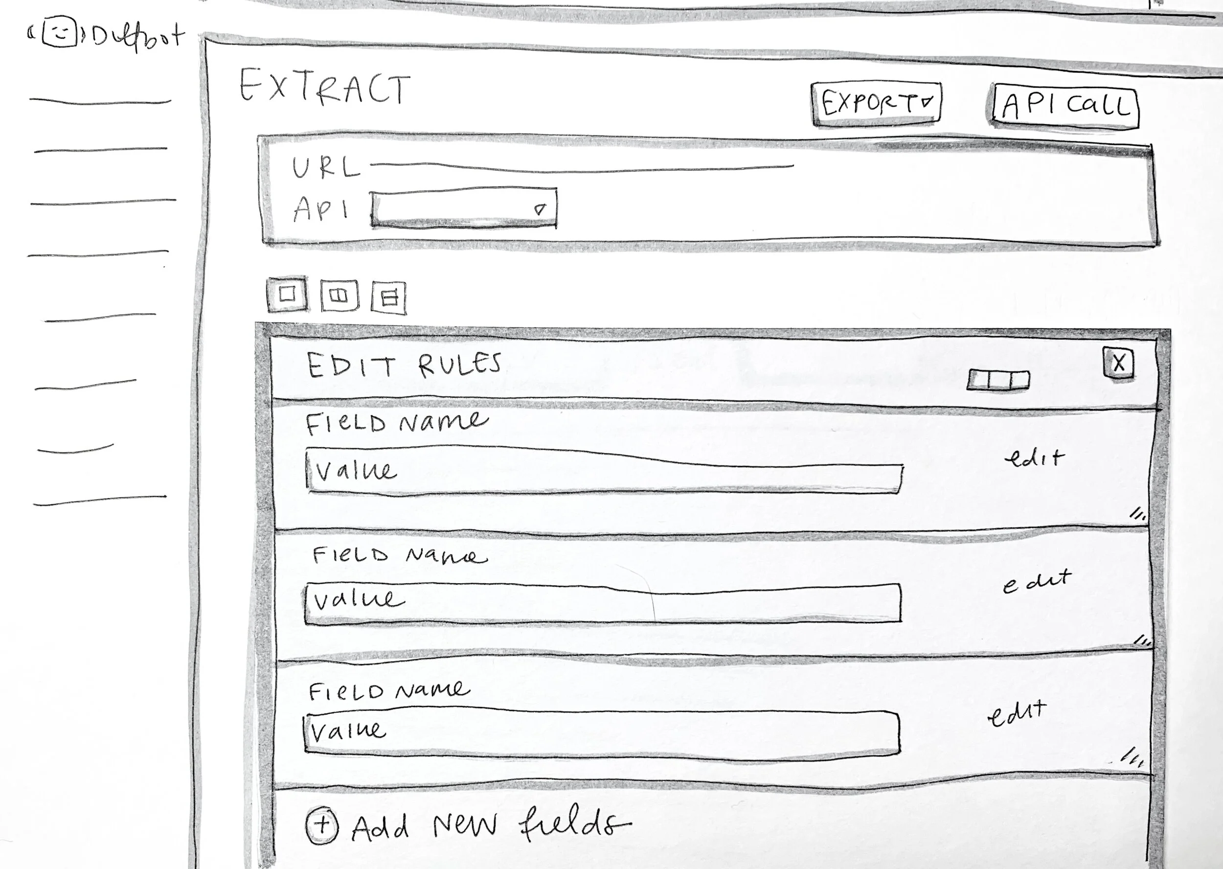
Edit API rules

Edit rules overlay, rather than a separate tool
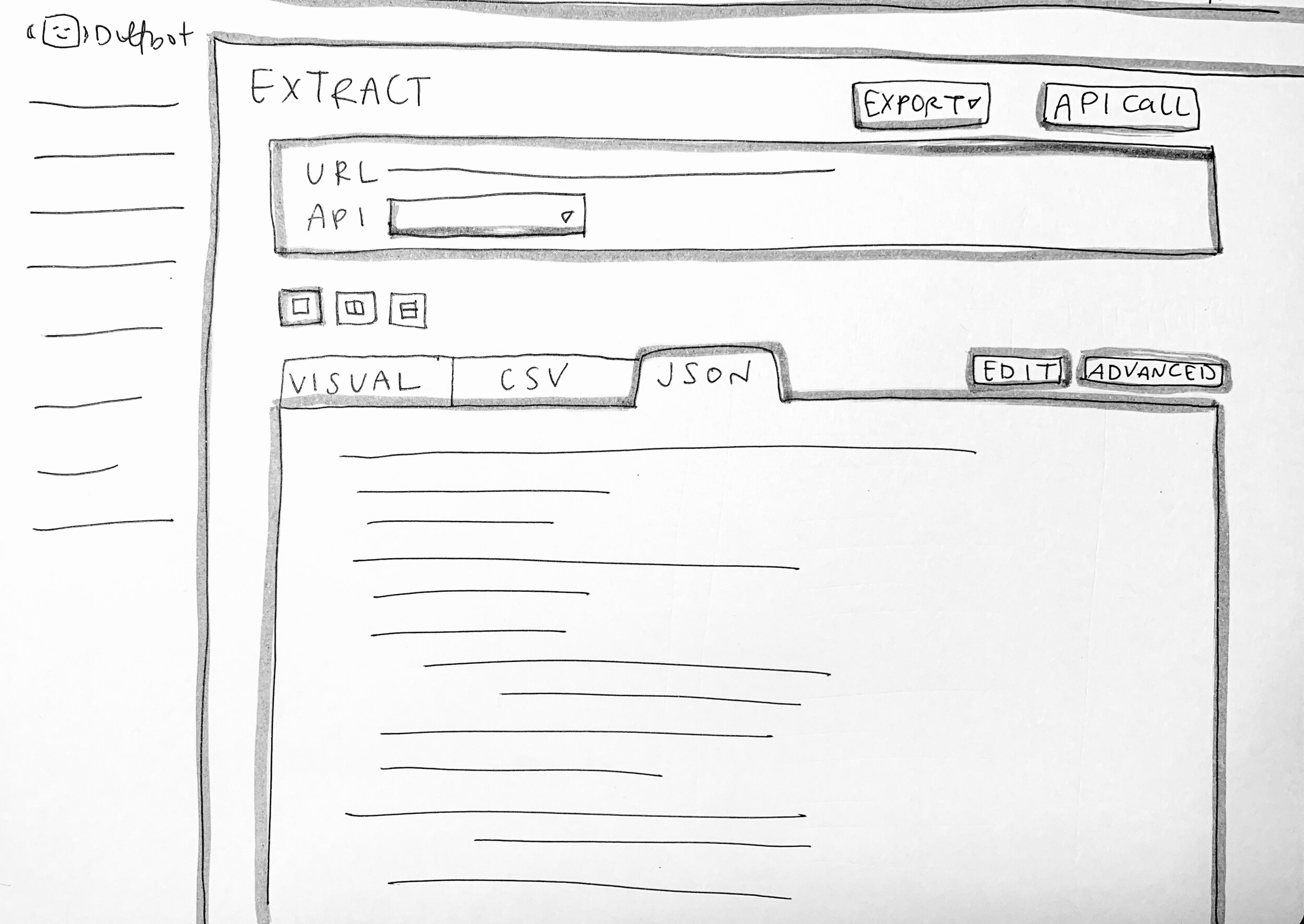
Extract main page - single view

Extract main page - double view
Developers need delight too
Looking for the balance between endless lines of code and something fun to look at
It was tricky for us to understand what would be acceptable to software developers who are just looking for efficiency and effectiveness. Is it true that a fully functional tool is all that’s wanted? Or would users also appreciate some added enjoyment?
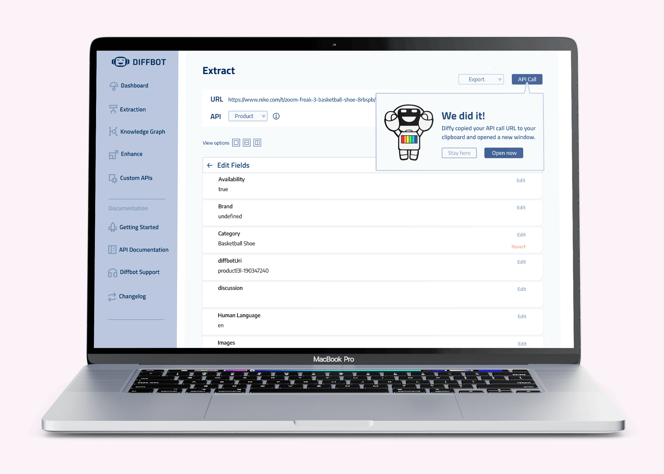
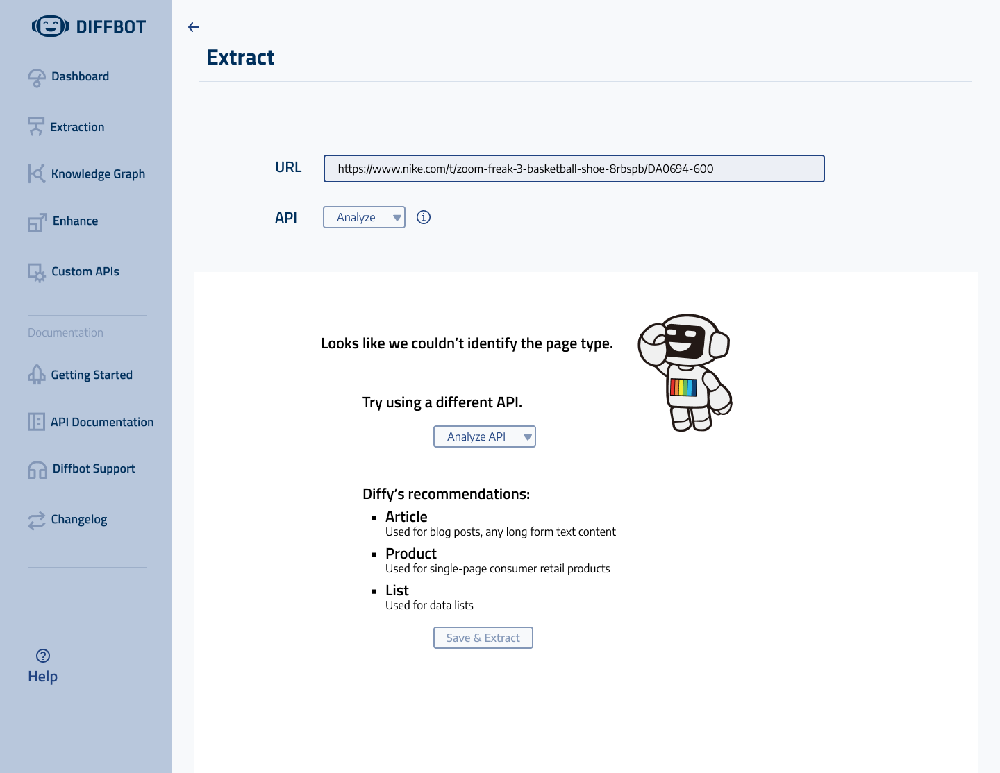
With balance in mind, we added a few moments of delight in the experience. The mascot, Diffy, would appear on the error pages to let users know something didn’t go as planned. And instead of just getting an API call URL (which is a beautiful chunk of code), they would also get a modal message from Diffy to let them know the job was successfully completed.
A fresh, new, entirely connected interface
Designing a user-friendly prototype and conducting usability testing
With more refined sketches in hand, we put together a design kit and created wireframes of some essential screens. In considering how each one would connect, we left some room for further discussion, development, and development before putting together a working prototype.
This design kit was based on Diffbot’s pre-existing design systems, with some elements designed by me. Working off their original color palette, we added more elements in orange, and upped the contrast in colors. It was important to make sure we designed for accessibility, and had enough contrast and flexibility for a responsive design.
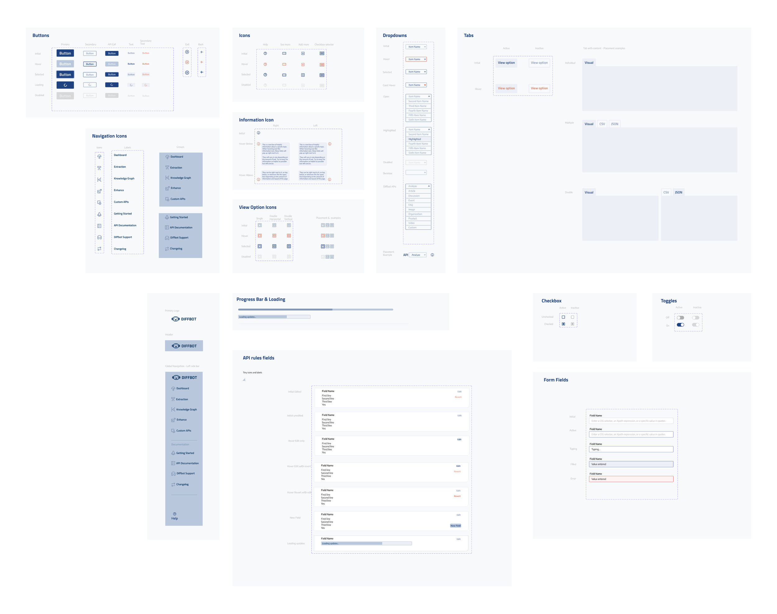
Full design kit
Our biggest design consideration: we are building an interface that allows users to troubleshoot independently. This means connecting users with edit options, settings, advanced options, and tools that were previously hidden or entirely disconnected. Instead of creating a straightforward, problem-free path for our usability testers, we built in several types of errors to see how they would solve them.
One of our additional key design considerations was to include multiple ways of viewing the extracted data. Our final working prototype connects Extract with the ability to edit API rules. Our goal with usability testing was to find out if these features would function properly and make a difference in the experience. Though the platform would mostly be used by developers on desktops, it was still key to be sure the design would be responsive to any viewport size. Allowing the extracted data to appear top to bottom rather than left to right would accommodate a stretch test.
Our usability testing was run with five people, one current Diffbot user and four software developers who had never touched the program. Each came from unique backgrounds but were all familiar with the concept of running extractions or web crawls. After bringing our testing notes together, we found several unified insights.

Insights
Intuitive navigation overall
Unique preferences for view options
Frequent use of tool tips
Some confusion with Diffbot jargon (API, API Call button)
Needed more information on specific APIs
Confusion about second save button
“I don’t like it when it feels like the computer is lying to me.”
– Test User (referring to second save button)
Some of these findings are unique to new users, because seasoned Diffbot users would understand the basic terminology and navigation. It was still imperative to remember our Efficient Engineer and think about new users while reconsidering elements of our design.
So moving forward, we came up with a few iterations we would recommend for the Diffbot team to take.
Use the error page as an educational opportunity
Communicating clearly to show that it isn’t user error
Using a neutral or encouraging message to create a more positive experience overall
Leading to clear next steps, either with more explicit buttons or that offer more explanation
Change the second save button into a feedback message
Providing a clear message with copy such as “your changes have been saved” would feel more trustworthy to users
Adding clear messaging will help users understand what is happening so they can feel in control as they use the tool
Add more tool tips
Presenting helpful information on specific APIs, advanced settings, etc.
Taking advantage of opportunities to teach users and help them familiarize with the tool
Considering the non-expert users that Diffbot hopes to attract and retain
Looking back and looking ahead
Wrapping up with final reflections and next steps
To close up this project, we presented our research and design to Jerome, Head of Growth and our main point of contact at Diffbot, and to Mike, the founder and CEO. We enjoyed sharing our research and design processes with them and getting to know even more of their long term goals and company dreams in follow-up conversations.
Mike emphasized wanting this new interface to be able to be understood by non-developers alike. Our strongest recommendation was to add more tool tips and pointers to give direction and definition to each step of the way.
We also presented the design to other design colleagues, who agreed that the new tool seems straightforward and simple to navigate. The interface design considers both experienced and brand new users, developers and otherwise. As the developers work on integrating our design choices, we hope to see updates on the business impact.
